

Wednesday, April 28, 2010
Enforced Template
Before i am off to Canada, i wanted to leave you with this. It is a blank printable template that i have made for all of of awesome viewers. I hope with this we get more art that i can post. You can print it and color then scan you work of just plop a logo on there. I just want to see what cha got. I would be happy to post almost anything. I took some close up looks at some authentic jerseys i have and made the template as close to it as i could using powerpoint. If you have any questions let me know by commenting or emailing me. After today the template will be available in the "extras" tab below the title.

Tuesday, April 27, 2010
Monday, April 26, 2010
Dominican Republic Rebels
These are probably the simplest jerseys i have made for the CHL. I'm not saying there bad just simple. I used a joined "DR" for the logo. The colors i chose are maroon and a dark blue. I think the logo color looks great on the jersey colors. I think the best part of this set is the stripes on the 3rd jersey. I think the way they join would look cool on the ice. The home and away jerseys are modern and simple like i said.


 --------------------------------------------------------------------
My hockey team is off to Canada for a tournament on Thursday. There will not be any new posts but when i get back i plan on adding a few concepts between projects.
Enjoy-
Jack


 --------------------------------------------------------------------
My hockey team is off to Canada for a tournament on Thursday. There will not be any new posts but when i get back i plan on adding a few concepts between projects.
Enjoy-
Jack
Friday, April 23, 2010
Puerto Rico Palms
Happy Friday everyone.
Here is another set of jerseys designed from the look of the flag. The flag doesn't look much like the jerseys i made but i used a few elements from the flag that made it stick out. The logo just kind-of fits on the jersey of a star with "PR" in the center.The home jersey is red with blue and white stripes going across with the star on top. The away is very similar but white with blue and red stripes. The 3rd is the same design but blue.


 ---------------------------------------------------------------------
If you haven't figured it out yet, we only have one more Caribbean team, the Dominican Republic. I plan on posting them sometime over the weekend. After that i will soon release details about Enforced logos next project. (That's right, projects keep coming...)
Tuesday, April 20, 2010
Key West Quest
This is one of the teams were the logo does have a little to do with the team name. I figured west and quest sound good together, so why not make their logo together? The primary logo is a light blue and orange compass with a navy blue key on the west side of the compass. (key west?). I think this also made it more Caribbeanish? This team is also my only team with a secondary logo. It is a blue circle with an orange sun shining on the "KWQ" making a reflection on what is supposed to be water...The orange circle doesn't go all the way around so the sun stands out a little more. The home and away jerseys are just supposed to look modern and be simple at the same time. The 3rd is a orange more of a traditional look with more classic stripes and the same logo. 


Friday, April 16, 2010
Haiti Wave
I hope u enjoy the 5th jerseys from the Caribbean project. These are the Haiti concepts i put together. If you haven't seen it yet, the site, Icethetics, has put together an amazing amount of great uniforms for Haiti after the earth quake. You can check those out by clicking here. After loving those jerseys i wanted to stay away from any of my jerseys looking like those. Only because i don't want anyone mad about stealing or what ever. These jerseys are all mine. I used the regular logo from the flag. All of the jerseys are based on the flag and look very busy. But if you look closely at the detail they are really not to crazy. Yes they have a lot of colors going on, but the design is not to crazy. If any of the jerseys are crazy it is the 3rd jersey. They have stripes going across horizontaly but are stopped with white on the sides. The home and away are similar but i used much more white on the away jersey so you can tell it is not to dark.
Enjoy


If you would like to donate to the Haiti Earth Quake fund, click here.
Enjoy


If you would like to donate to the Haiti Earth Quake fund, click here.
Tuesday, April 13, 2010
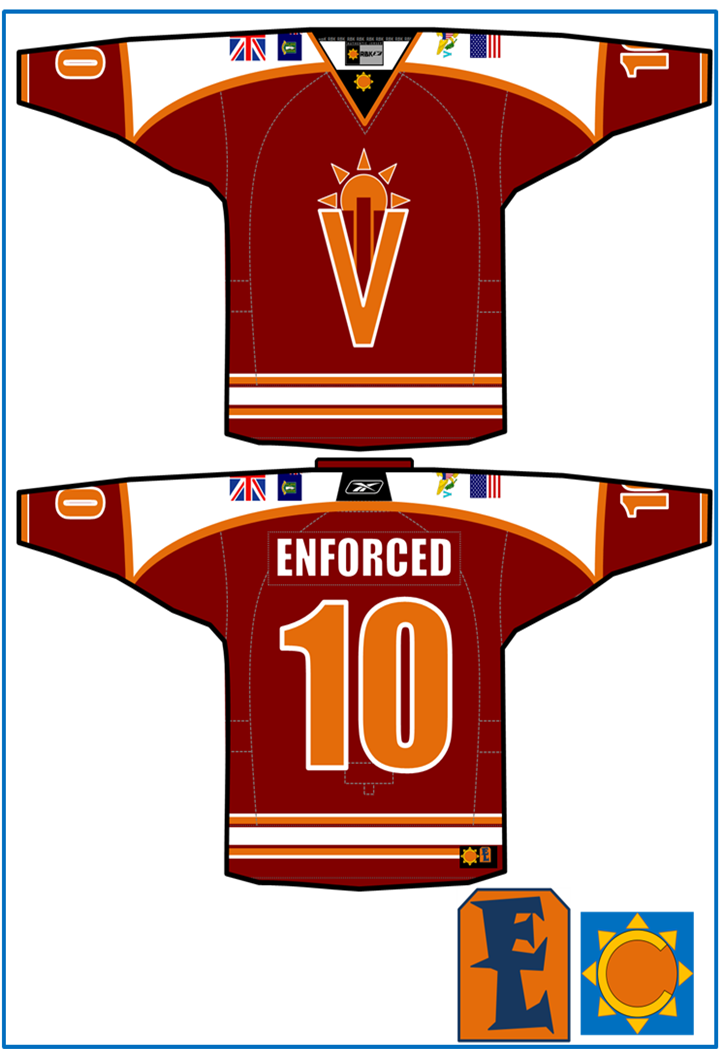
Virgin Islands Voyage
These are my favorite jerseys of the series and i tired very hard to make them perfect. My trip to the Virgin Islands really helped with the concept. It is not really a country with a color so i picked my own. I picked these for 2 reasons. I wanted a combination of 2 colors that have not been seen together much and i saw a lot of these colors when i was there. The logo was formed when i was doodling on the beach and put together a sketch of "VI" with a sunset. The logo looked cooler in my head but turned out ok. All of the jerseys were drawn up while i was on the plane on my way down there. For the home and aways i used a shoulder color disappearing as it got lower. The 3rd jersey is a different color and design. I liked the jersey having a different shoulder color with a cool design. On each sleeve of every jersey i added 2 flags. On the right i have the British flag and the British Virgin Islands flag. On the left you see the American flag and the American Virgin Islands flag.


Sunday, April 11, 2010
Bahamas Bananas
The Bahamas have some cool colors. Theres not to much to tell about this set of logos and jerseys. The jeresy are pretty close to the flag but have some changes in colors and i also added "Bahamas". The 3rd jersey is a script with the number under the name on a black jerseys with the other logo on the shoulder. Nothing really special but be expecting another team sooner than later.
Enjoy


 PS-
PS-
If you have anything you want to show the world, Caribbean, or anything else for hockey art, send it to me at
enforcedlogos@yahoo.com
Enjoy


 PS-
PS-If you have anything you want to show the world, Caribbean, or anything else for hockey art, send it to me at
enforcedlogos@yahoo.com
Tuesday, April 6, 2010
Cuba Sand Storm
Now that i look at it, i probably could of thought of a better name for Cuba. But oh well doesn't have anything to do with the jerseys or logos. I again used the colors of the countries flag and based the odd shaped logo on the flag. The jerseys have a traditional look but haven't been seen before. There has been stripes going around the chest on some jerseys, but not to many look like this. These have the base color in the middle but 3 lines on top and bottom of the logo. On the 3rd jersey i added blue on the chest on the red jersey.


Monday, April 5, 2010
Jamaica Journey
This is my first Caribbean team and it got the whole thing started.When i was making it, i didn't plan on having a whole project about it. I think that was one thing that stood out about this team. The home and away jerseys are based pretty strongly on the flag. The logo has the most flag components. Its a round version on the flag with hockey sticks separating the colors. The home and away jerseys are pretty simple and traditional but the bottom stripes also look similar to the flag. The 3rd jersey is nothing special. Again it is very traditional but works good for team Jamaica. 


 -Jack
-Jack


 -Jack
-Jack
Sunday, April 4, 2010

Rebranding The NHL
Anaheim Ducks Rebrand
Atlanta Thrashers Rebrand
Boston Bruins Rebrand
Buffalo Sabres Rebrand
Calgary Flames Rebrand
Carolina Hurricanes Rebrand
Chicago Blackhawks Rebrand
Colorado Avalanche Rebrand
Columbus Blue Jackets Rebrand
Dallas Stars Rebrand
Detriot Red Wings Rebrand
Edmonton Oilers Rebrand
Florida Panthers Rebrand
Los Angeles Kings Rebrand
Minnesota Wild Rebrand
Montreal Canadiens Rebrand
Nashville Predators Rebrand
New Jersey Devils Rebrand
New York Islanders Rebrand
New York Rangers Rebrand
Ottawa Senators Rebrand
Philadelphia Flyers Rebrand
Phoenix Coyotes Rebrand
Pittsburgh Penguins Rebrand
San Jose Sharks Rebrand
St. Louis Blues Rebrand
Tampa Bay Lightning Rebrand
Toronto Maple Leafs Rebrand
Vancouver Canucks Rebrand
Washington Captials Rebrand
2010 Winter Classic Rebrand
2010 All-Star Rebrand
Happy Easter
Hey guys im back from my trip. I had a great time but i am glad to be back. I did get a chance to check my blog when i was down there. I would like to thank Eric for posting my concepts while i i was gone. He made a few other changes that are good. Today i am busy but will make a few changes.Nothing major but if you see posts that don't make sense, don't worry the blog will be back to normal shortly. I did have some time to draw up some jerseys and logos and i will be finishing the CHL and posting them soon. Like i said ignore most of todays posts because we are doing some construction.
Thanks and enjoy,
Jack
Thursday, April 1, 2010

Subscribe to:
Posts (Atom)
