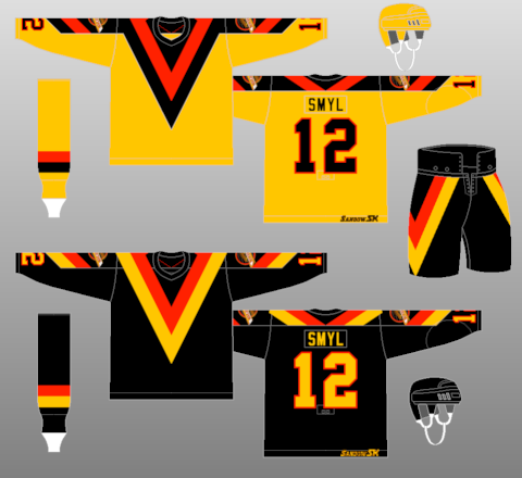
The Coyotes have a nice sharp logo. The colors work perfect for a team located in the desert. I think the team's current jerseys are very boring, just look at the home jerseys. All maroon with three single white stripes. The team is tan. They definitely could have used more of that in their uniforms. With the uniforms I made, I used much more black for the team. I like the team's current 3rd jerseys, but I am not a big fan of the logo. I used the same logo and a new script for the team. I used a tan/sand color for the away jerseys. On the 3rd jerseys I used a low number on the sleeves like the 80's Canucks jerseys.


No comments:
Post a Comment