Sunday, January 31, 2010

Canucks Concepts


Sorry for the shortage of post over the weekend. I visited the University of Illinois for a club hockey game. I noticed the uniforms were not as thorough as they could be, in my opinion. I'm not saying they were bad, but they could use work. Over this week I'll work on some concepts for them. If you have any ideas, send them to us. The team is blue, orange, and white.

Here we have a Canucks concept from Vjimbo. He's using a retro route with the vintage colors. I noticed he still uses the stick in the rink logo on the sleeves, which I love, but they could use a color up-grade. Overall, a very cool jersey!


If you noticed a change in the title (hard to miss), it's to celebrate the start of February and the upcoming Valentine's Day. Send us your Valentine's Day concepts, logos, or jerseys at:

Enforcedlogos@yahoo.com

Speaking of the Leafs...

WOW! HUGE trades made today by Brian Burke!

Burke managed to make a couple of MAJOR deals today. The trades involved Toronto, Calgary, and Anaheim. Here is a breakdown:

Toronto Gets:
Dion Phaneuf
Fredrik Sjostrom
Prospect Keith Aulie

Calgary Gets:
Matt Stajan
Niklas Hagman
Ian White
Jamal Mayers


Toronto Gets:
Jean-Sebastien Giguere

Anaheim Gets:
Vesa Toskala
Jason Blake

WOW! I liked Phaneuf on Calgary, but like him even more with the Leafs! What do you guys think about this one?

Friday, January 29, 2010

Next Project

Hey everyone! Happy Hockey Weekend Across America weekend! Jack and I will be starting our next project within the next couple of days. We will not post anything about it or post any pictures until we are done. We will try to keep posting some concepts to have some new stuff up for you to look at.

Keep sending us concepts!

enforcedlogos@yahoo.com

Thanks!

Eric

Thursday, January 28, 2010

Minnesota Classic


The Wild have not been around for too many years. If they used their first uniforms, it would only go back a few years. So I made a new uniform made to look classic & original. I used they same colors and home logo and added some stripes.


-------------------------------------------------------------------------------------


The Avalanche have the same problem as the Wild. I was able to use a 1979 QUEBEC NORDIQUES uniform (Avalanche's original team).

Wednesday, January 27, 2010

New York Winter Classic


For the Rangers, I used a 1946 jersey the team used. I used it because this was one of the only changes the team has ever had in their uniforms. I love them. They fit perfectly for the "classic" jersey.

------------------------------------------------------------------------------------


The Islanders franchice does not go as far back as some NHL teams. So there was not to much to pick from for this team. I used the earliest 1972 jersey for the Islanders.

Winter Classic Preview

I have two 2011 Winter Classics planned.

First, At Yankee Stadium- New York Rangers VS New York Islanders


Next, I have the Minnesota Wild playing the Colorado Avalanche playing at Target Stadium in Minnesota.


Don't worry, uniforms for all four teams will arrive shortly...if you have any good match ups, or concepts of your own, send them to us at:

enforcedlogos@yahoo.com

Ducks 3rds


Just for fun post. Not much you can do with the Ducks. These are modeled after the Mighty Ducks old jerseys, not good. We'll see what the team does. I wanted to get done as fast as I could. Now we can start on new things. Enjoy!

Lightning 3rds


I'm not as happy with these as I am some. I think many people like the blue jerseys they used. I also think some people agree with me and HATE the "BOLTS" going down the jersey. In some concepts I've seen, people have used the Florida logo as the crest. I have not seen too many jersey with the regular logo on a blue jersey. That is what I did. I have one more concept then we'll move on to the 2011 Winter Classic concepts!

Tuesday, January 26, 2010

Penguins Fan Art


This concept is from Frank. He got it to me on Facebook. He is a big time Penguins fan and is disappointed the team is losing the baby blue 3rds next season. He used black, baby blue, and a gold outline. I like it. He asked me if i could make a better quality one, so I plan on getting that up by the end of the day. I will make a few changes, but this is still Frank's art.


UPDATE: Frank's edited work,

Monday, January 25, 2010

Hawks Repair


Hi everyone! Last year, the Blackhawks used a black version on their whites for their homes. I think they looked terrible. But I have made some changes for the best and I think the jerseys look better.

First of all, I needed to change the colors of the shoulder patch. Such a great logo gone to waste with the color choice.

I have four jerseys here. Two feature the regular logo with different shoulder patches, and a different striping pattern. The other two feature the shoulder patches I created as the logo and different stripes as well.

Let me know your thoughts!

Jack

NOTE
I plan on adding some other Blackhawks concepts soon!
Sorry for the out-of-towners who don't like Chicago!

Flames 3rds


With the Flames, I used a current jersey with black. In my opinion, the team has yet to have a good black jersey. I like their throw back that they are using but they should do something like this. I used a white C as the crest because I don't think the team would want that many dark colors on their jerseys.

Sunday, January 24, 2010

Islanders 3rds Jerseys


The Islanders didn't change much with their jerseys when RBK took over. The 3rds aren't much different than their homes either. With mine, I used their secondary color, orange. This was kind of hard being a Flyers fan because I think we should be the only ones with it. Anyways, I kept the design the same with a different color.

By the way,

In a few more posts, we'll have all of the NHL's 3rd jerseys covered!

Thanks!

Jack

Saturday, January 23, 2010

Caps Concept


This Jersey Comes from "SAMXXTRUCK" Not bad. They had the same idea with putting the Weagle as the crest. Wucha Think?

Stars 3rds


The stars really messed up with the Edge system. The team has a pretty nice and creative logo, and didn't even use it for their home jerseys...or their 3rds. And the team used white as their 3rds. Come on guys. Use green or at least a logo! I used a design from the 90. I simplified the logo because apparently they don't like it as it was. Just made some changes but i think its not bad, well not as bad as their current 3rds.

Lets see some readers concepts! Send em to us @

Enforcedlogos@yahoo.com

Friday, January 22, 2010

Devils 3rds


Happy Friday!

The Devils have classic uniforms. By classic i mean they haven't change anything besides their colors since the became a team in 1982. They have had the same uniforms with no changes during the edge take over, and no 3rd jerseys. With that being said with the ones i made i didn't want to upset the Jersey fans to much so i kept it classic. I would be surprised to see the team make any changes knowing the haven't for 30 years.

Thursday, January 21, 2010

Flyers 3rds


Next season the flyers are using the winter classic as their away uniforms and the retro orange as their homes. This 3rds are for when that happens.

It really bugs me to put this logo on the jersey. yes i made it and im proud of it but i wanted the Flyers rebrand to be a surprise. well theres a sneak peak at the Flyers rebrand. I used the same basic jersey as the teams first 3rds used in the 90s but i made them black. I made the sleeves orange the logo orange and the logo orange. Happy Halloween. The name plate i had to use because on both the home and away they have them. I love them on the flyers but only the flyers. If every team got them i think they would look terrible.


The US Olympic team also has different colors name plates for this year in Vancouver.

Tuesday, January 19, 2010

Blue Jackets 3rds


With the blue jackets, i kept the same colors for their 3rds. In fact, i did not change much at all from the teams uniforms. The team has a home blue jersey and a white away, so i figured why not finish it off with a red 3rd jersey concept.

Monday, January 18, 2010

5 3rds

Sorry for the shortage of post over the weekend. I have had a hard time getting to my computer and I'm sorry to say, there is not much to look at tonight. I have a list of 5 teams with my favorite 3rd jerseys in the NHL. I liked them so much i just could not change them. I under stand the lack of creativity but i don't think i could do anything to compare to these jerseys. The 5 jerseys i you see below are from NHLuniforms.com the hockey uniform database. I did not make any of these and i can not thank the web sight enough for the uniforms. All the 3rd jerseys are located in the middle of the home and away uniforms. Enjoy and expect a concept from me tomorrow.

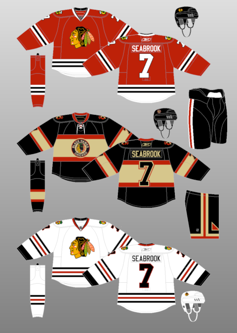
Hawks Coming from Chicago, its hard to not like these uniforms. I like them way better than the old 3rds from last season. I think the old jerseys were just boring to look at. I like how the hawks changed the colors and went in a retro direction from the jerseys used in their winter classic. I also like how they added a tan and red "C tomahawk" on the shoulder. The exmulti colored logo the team used on their other 3rds just looked like a joke.

Pens The Penguins came before the Blackhawks in the winter classic and also used their uniforms for their 3rds. The team doesn't use baby blue or navy blue in their regular uniforms but it makes a nice retro touch as well.

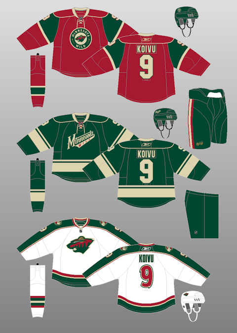
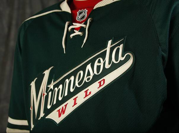
WildThe Wild have my favorite jerseys. They have one of the best logos in hockey as well. They don't have to put the logo on the jersey for it to be my favorite. The green jerseys are also great, the team added a few tones of red and it made the jersey perfect. On the picture i linked you cant see the real effect so here is a
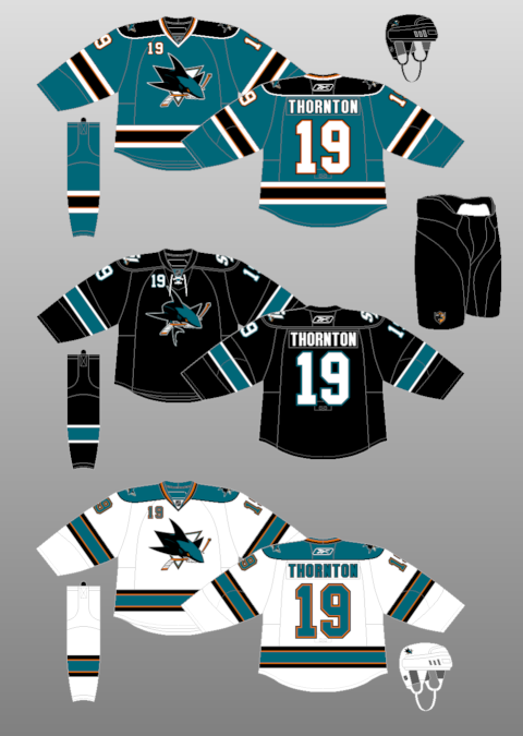
 better look.

Sharks The sharks have a great logo as well. the 2 logos, the one on the home and away and the one on the 3rds, are not to different. I like them both just as much. The club also has a great color combo. The gold added with the edge uniform switch, added great detail. The 3rds are a modern original look with some dark colors and the laces added on the collar.

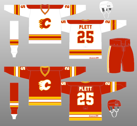
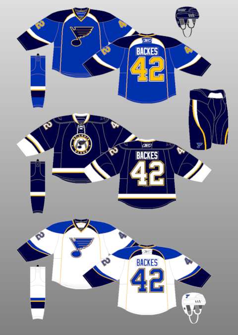
Blues The blues also went in a retro direction. The team added elements from the city by adding the arch in the background of the crest. The jersey is also a darker blue than the home jerseys. The team added the regular logos on the shoulders which i think was unneeded but i don't know what i would do with the shoulders.

I hope you enjoyed today's post!


UPDATE-

I found a better picture of the hawks alternate logo!

Friday, January 15, 2010

Cats Concept


Ive been working on orignalizing the NHL since i got home from school today. I'm happy to say,i got 8 logos and jerseys done for the NHL. When i was going through my "notes" i found this. I made this before the Panthers released their 3rds. I'm not saying they should of used these but i like the idea of using the same design but on a red jersey. In my opinion, i don't think its that much of a down grade. Let me know your thoughts. I plan on adding some more posts over the course of tomorrow.

Thrashers 3rds


Merry Friday readers

The thrashers have a color over load i think. Their 3rds don't have much of the same colors as they do in their home and away jerseys. Mine don't really either so i cant criticize that. Many people think their jerseys look footballish or baseballish. I think the word marks don't work for many teams with the exception of the Capitals. The Thrashers look more football jersey like because they have the numbers under the word mark. I do like the color of Atlanta's 3rd jerseys. So i used that for mine. I used a unused logo from the team that i love. i added "THRASHERS" down the sleeve to match the "ATLANTA" on the home and other sleeve. On the bottom of the jersey i added stripes just to add to the "thrash"

Thursday, January 14, 2010

Maple Leafs 3rds


How about this logo? I think it was one of the best things the club has done jersey wise (besides going to blue after the St.Pats). I love this modern logo and I don't understand why the team doesn't add this on more things. With the modern touch to my jersey, I also added silver to the jersey. I think it is hard working with the Leafs because of the color shortage. I thought I might as well add a modern color to a new modern jersey.

Wednesday, January 13, 2010

Explanation For Hawks 3rd

Hey guys. I wanted to have a throwback jersey as the Hawks third. I LOVE their current thirds, and thought that swapping the colors around might look decent. In my draw-up, the "vintage white" was not quite as dark as Jack's version on the computer. I think you all know what the color is and that I didn't design it to be tan. Anyway, not much you can do about it, no "vintage white" in most color pallets on computers. Please let us know what you think, any input is much appreciated. Jack and I have a good idea that we might use before rebranding, so stay tuned.

Thanks!
Eric

Hawks 3rds


Happy 20th Post

This is my Blackhawks 3rd jerseys and part 2 of Eric's. I'm very happy with what he did with this as well. It is a reversed jersey of their current 3rd/Winter Classic. I like that he was able to add the tanish color into a full jersey. On most jerseys, i don't think it looks to great but i think Eric was able to pull this look off perfectly!

Tuesday, January 12, 2010

Explanation

Hey guys, I'm Eric, Jack's partner here on EL. Jack printed up some templates with the Hawks logo and told me to finish them how I wanted. I wanted to keep the home and road jerseys close to what they are now. Once Jack posts the 3rd Jersey, I will explain that as well.

Thanks!

Eric

Hawks Concepts


I made the logos, Eric made these his first jerseys! Congrats to him. We will be adding small rebrands between our projects to add something to the blog. You will see something like this in the rebranding of the NHL however, this is not part of that project. but now for the most part when Eric gets on I'll let him explain the jerseys he has created! And if you have any questions on the logos I made, let me know! I plan on adding the 3rd jersey tomorrow.

Kings 3rds


LA Kings. Many people think that the Edge system messed up the Kings. I understand why they think that, but I also like some elements of the new jerseys. Some Kings fans also think they should go back to purple and gold. I would like to see that, but I don't mind the current colors. I added purple as the main color because this team doesn't need another black jersey. I used the same logo but added a little purple (around the shapes). Let me know your thoughts.

Today I am also adding a Blackhawks concept...

Monday, January 11, 2010

Preds 3rds


In my opinion, the Predators have a great logo. My hockey team, the Cyclones, used the same jersey with a different logo as the Preds did during the pre-edge era. I think they are great. I am also not disappointed in the Predators 3rd jersey. I think they had the right mind set when they went with something different than everyone else in the NHL, but wit an original look to the uniforms. The black and white checker board on the bottom on there current jersey, does not go with the teams colors. With my jersey, i followed the same design but used in my taste, better colors.
ENJOY!

Business

Another Monday here on Enforced Logos, don't worry, I do have a concept post for you today. I have some business I have to do first. First of all I would like to welcome the newest member of the Enforced Logos team, Eric. He will be adding some elements to the blog for the better. We have some great ideas in mind and our blog will continue to get better. I also would like to make the announcement of our new fan art email address! Anyone can send us art that they have made involving anything hockey art! Eric and I will try to post as many as we can as often as we can. Keep on visiting!

Reach us with your name (optional) and your concepts @... enforcedlogos@yahoo.com

-Jack

Sunday, January 10, 2010

Habs 3rds


Sorry for the late post tonight. I had a busy day but am happy to say I got another concept up. This is my Canadians 3rd jersey. It is based on the anniversary jersey they wore this season a few times. There are a few minor changes but nothing major. Most people either love these jerseys or hate them. I happen to love them. As a Flyers fan, I also like the different color name plate. The logo you see here is much different than the Habs current one. It is a blue vision with again some minor changes. You will see a similar logo when the rebranding begins.

note- The Flames jersey I posted a few days ago was just for fun and not a serious jersey. Let me know your thoughts on all of my posts!

Saturday, January 9, 2010

Caps 3rds


Good morning-

I'm sure most hockey fans have seen a concept of a Capitals 3rd jersey some time or another. Everyone knows the Caps should use the "weagle" for their alternate jerseys. For readers that don't know, the weagle is the teams current alternate logo use on the home and away shoulder. It is a eagle forming a "W" with the capital building on the bottom. With this jersey I used the same design but dark navy blue. I added the weagle instead of just the word mark. If the team does end up doing this, I would not be surprised to see them as a full time home and road jersey.

Friday, January 8, 2010

Freaky Flames


I had some extra time eon this Friday night...wuda party.

I got this jersey from deep in my days of concepts. Thought it might amuse some of my readers and get their minds off of the 3rds for a bit. I'll do this here and there to spice up the blog. Which reminds me, don't get used to the quality of the jerseys I have put up. I have some I made earlier which I think are just as good just not as much time put in to them. You'll know when you see, not much but you'll realize it.

Thanks, have a great weekend.

Canes 3rds


Happy Friday every one!

I give you the Hurricanes.
I kept the black solid color for these nice alternate jerseys. I also used the same alternate logo the team used. I had another logo in mind but you will see that when I rebrand the NHL later in my blog. I added many more red squares all over the jersey as well. For my readers who don't know, the red squares with the black small square in the middle that are on the currently used on Carolina's home and away jerseys are the hurricane flag. I think it was a nice touch and is not used enough. I hoped you enjoyed today's update! I have a busy weekend coming up but I'll get as many concepts up as possible!

Go Flyers (and Blackhawks)!

Thursday, January 7, 2010

Facebook!


Thought I'd make an update...

I have just made a Facebook page for Enforced Logos! Includes a sneak peak at the Canes 3rds!

http://www.facebook.com/?ref=home#/pages/Enforced-Logos/259581337663?ref=nf

If you are visiting from Facebook, please enjoy!

(click to enlarge any image!)

Sabres 3rds


Hello.

I went in a different direction in color choice with the Sabres. I went with a dark gold color the franchise has not seen before. I kept the same basic design and logos but a different base color.

Expect to see one of my favorite tomorrow, the Hurricanes!

Wednesday, January 6, 2010

Avs 3rds


The Avs have some of the best colors in the NHL. I think for the most part they did great on their thirds. They used a retro look with the stripes, but I think many fans can agree they should loose the word mark. It doesn't look original and the team already did this with their first 3rd jersey (late 90s). I used the same color as their current thirds and modernized it. I use horizontal stripes on the sleeve to make it look new and fresh. I used the same logo, but added a circle. The shoulder logos are the same, but I added a small 2 color stripe at the bottom of the jersey.

Tuesday, January 5, 2010

Canucks 3rds


Personally, I love the logo the Canucks have been using as of late. The stick in the rink "c" is just a magic logo. I also agree the Canucks missed the mark on their 3rd jerseys not going green, but using the same color as their home jerseys for their 3rds. I kept the logo and jersey deign mostly the same, just made some minor changes to the colors and collar.

Bruins 3rds!


Ahh...

My favorite 3rd jersey I have made...

I made the Bruins 3rd jersey gold. I love Boston's jerseys as they are, but I couldn't get over them not going with gold 3rds! I think that back in the day, when the Bruins had yellow and brown uniforms, they were, and still are, the best. I wish I could have had brown be the trim color instead of black, but I wanted to keep the logos and current colors. I kept pretty much the same design just different colors and a few differences around the bottom of the jersey.

Rangers 3rds

I went with the old "Lady Liberty" logo that the Rangers used in the 90s with their 3rd jersey. I made the jersey look a little more modern with less diagonal stripes. I also tired to have a little bit of a lighter blue as they had in their earlier days. I also went in the "retro" direction with the laces on the collar.

Sens 3rds


The Sens have followed the footsteps of most teams in the NHL with their 3rds. They used a new logo, a jersey with new colors, and a brand new design. I tired bring back some of the old features from the original jerseys the team wore in the early 1900s. I used red as the main color (yes, it bugged me too) and added 2 stripes going through the middle and sleeves on the jersey. I took the logo the team once used in 1930.

Panthers 3rds

Every one knows the Panthers went in the wrong direction with their third jerseys, that included a dark blue base color and a baby/light blue accent. I made the same basic design but added red, a color the Panthers haven't had since the RBK system took over.