

Wednesday, April 28, 2010
Enforced Template
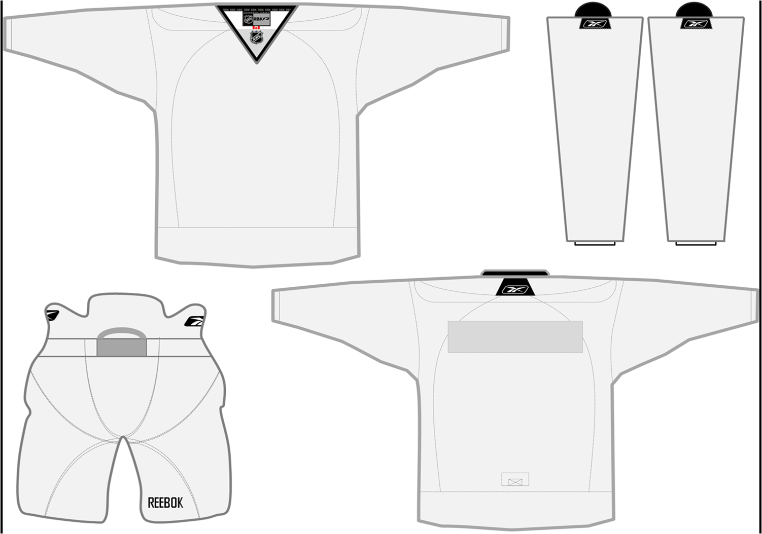
Before i am off to Canada, i wanted to leave you with this. It is a blank printable template that i have made for all of of awesome viewers. I hope with this we get more art that i can post. You can print it and color then scan you work of just plop a logo on there. I just want to see what cha got. I would be happy to post almost anything. I took some close up looks at some authentic jerseys i have and made the template as close to it as i could using powerpoint. If you have any questions let me know by commenting or emailing me. After today the template will be available in the "extras" tab below the title.

Tuesday, April 27, 2010
Monday, April 26, 2010
Dominican Republic Rebels
These are probably the simplest jerseys i have made for the CHL. I'm not saying there bad just simple. I used a joined "DR" for the logo. The colors i chose are maroon and a dark blue. I think the logo color looks great on the jersey colors. I think the best part of this set is the stripes on the 3rd jersey. I think the way they join would look cool on the ice. The home and away jerseys are modern and simple like i said.


 --------------------------------------------------------------------
My hockey team is off to Canada for a tournament on Thursday. There will not be any new posts but when i get back i plan on adding a few concepts between projects.
Enjoy-
Jack


 --------------------------------------------------------------------
My hockey team is off to Canada for a tournament on Thursday. There will not be any new posts but when i get back i plan on adding a few concepts between projects.
Enjoy-
Jack
Friday, April 23, 2010
Puerto Rico Palms
Happy Friday everyone.
Here is another set of jerseys designed from the look of the flag. The flag doesn't look much like the jerseys i made but i used a few elements from the flag that made it stick out. The logo just kind-of fits on the jersey of a star with "PR" in the center.The home jersey is red with blue and white stripes going across with the star on top. The away is very similar but white with blue and red stripes. The 3rd is the same design but blue.


 ---------------------------------------------------------------------
If you haven't figured it out yet, we only have one more Caribbean team, the Dominican Republic. I plan on posting them sometime over the weekend. After that i will soon release details about Enforced logos next project. (That's right, projects keep coming...)
Tuesday, April 20, 2010
Key West Quest
This is one of the teams were the logo does have a little to do with the team name. I figured west and quest sound good together, so why not make their logo together? The primary logo is a light blue and orange compass with a navy blue key on the west side of the compass. (key west?). I think this also made it more Caribbeanish? This team is also my only team with a secondary logo. It is a blue circle with an orange sun shining on the "KWQ" making a reflection on what is supposed to be water...The orange circle doesn't go all the way around so the sun stands out a little more. The home and away jerseys are just supposed to look modern and be simple at the same time. The 3rd is a orange more of a traditional look with more classic stripes and the same logo. 


Subscribe to:
Posts (Atom)
